


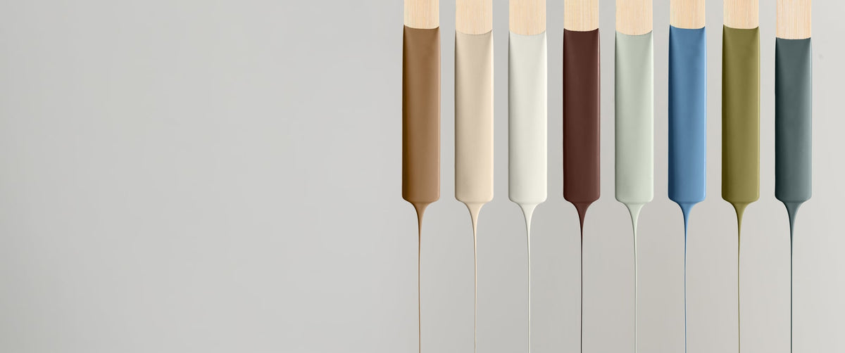
The 2027 Colour Edit: A Soulful Home

The 2027 Colour Edit: A Soulful Home
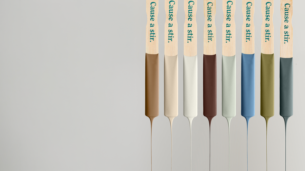
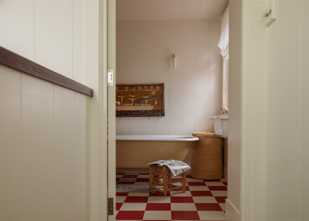
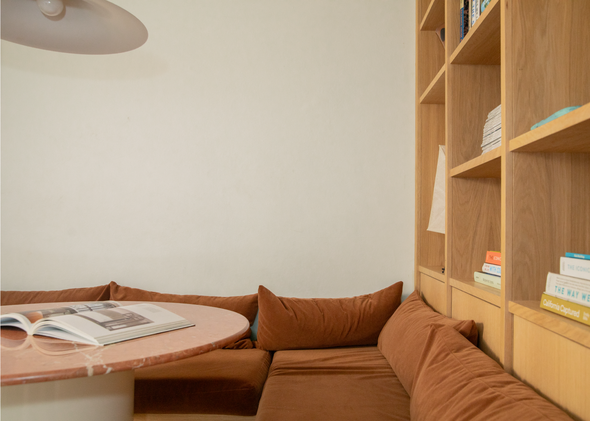
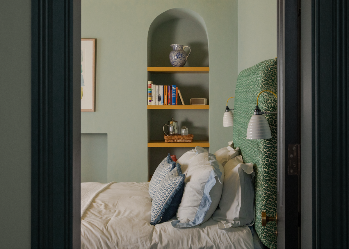
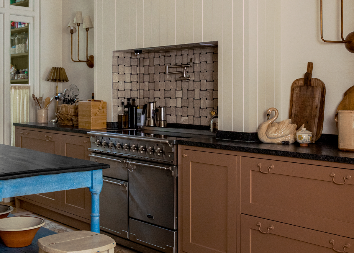
Introducing our 2027 Colour Edit, an exploration of colour not as decoration, but as deeply personal expressions of ourselves.

The 2027 Colour Edit: A Soulful Home

An exploration of colour not as decoration, but as deeply personal expressions of ourselves. The 2027 Colour Edit invites us to rediscover what our homes really feel like, rather than simply how they look.

The Edit also introduces three NEW colours to our range: Red 07, Pink 14 and Green 23. Their addition marks a natural evolution of our timeless palette, chosen not simply to reflect the cultural mood of 2027, but to anticipate the colours we believe will have lasting relevance.

New colour

Red 07

£2 Sample

New colour

Pink 14

£2 Sample

New colour

Green 23

£2 Sample

White 03

£2 Sample

Green 09

£2 Sample

Brown 02

£2 Sample

Blue 05

£2 Sample

Teal 03

£2 Sample

About the Edit
Something is shifting in how we think about colour. The question we're asking has changed. It's no longer "How does this look?" but "How does this feel?" And behind that question is a quiet certainty: our surroundings shouldn't just host our lives. They should hold them.

2027 is about soul and creating meaningful spaces that are deeply personal, timeless over trends and designed around our individual ways of living. Now that colour has been freed from rules and restrictions, it can do its deepest work: expressing memory, identity and feeling. Creating spaces that are unmistakably yours.

White 03

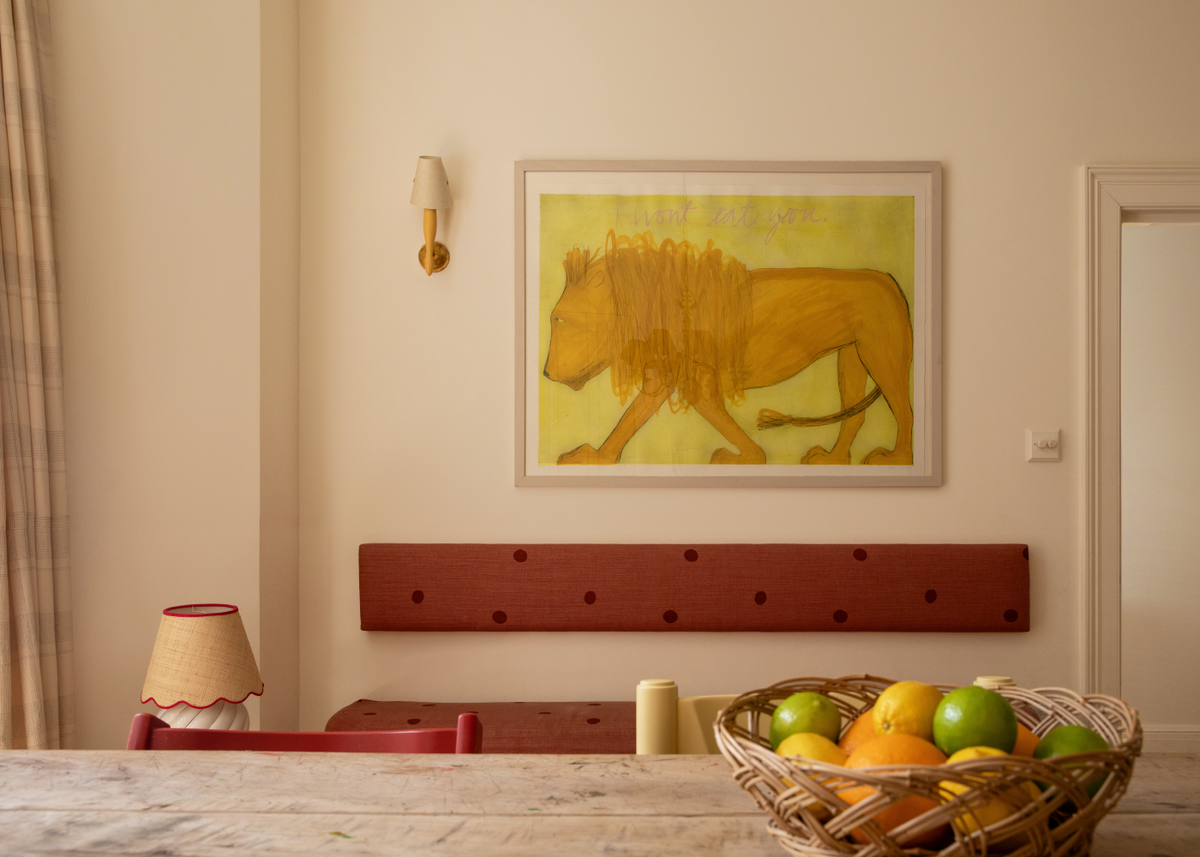
A warm, soft white with subtle creamy undertones. Light-enhancing and effortlessly versatile, White 03 creates breathing space within the home, allowing colour, texture and treasured possessions to take centre stage.

Green 09

Green 09

A light and balanced green with yellow and grey undertones. Green 09 is soothing and calming creating a sense of harmony between the mind and body.

Brown 02

Brown 02

A sophisticated earthy brown inspired by timber, soil and natural materials. Rich yet reassuring, Brown 02 provides a sense of permanence and authenticity, bringing weight, warmth and timeless character to any space.

Blue 05

Blue 05

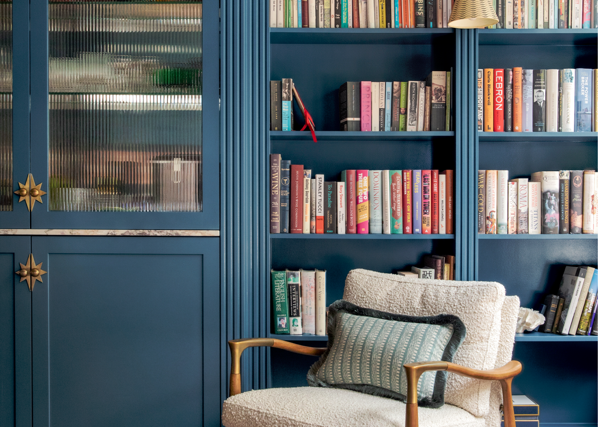
A beautifully balanced mid-blue softened with subtle lilac undertones. Inspiring yet calming, Blue 05 introduces openness, creativity and clarity, creating spaces that feel thoughtful, uplifting and full of possibility.

Teal 03

Teal 03

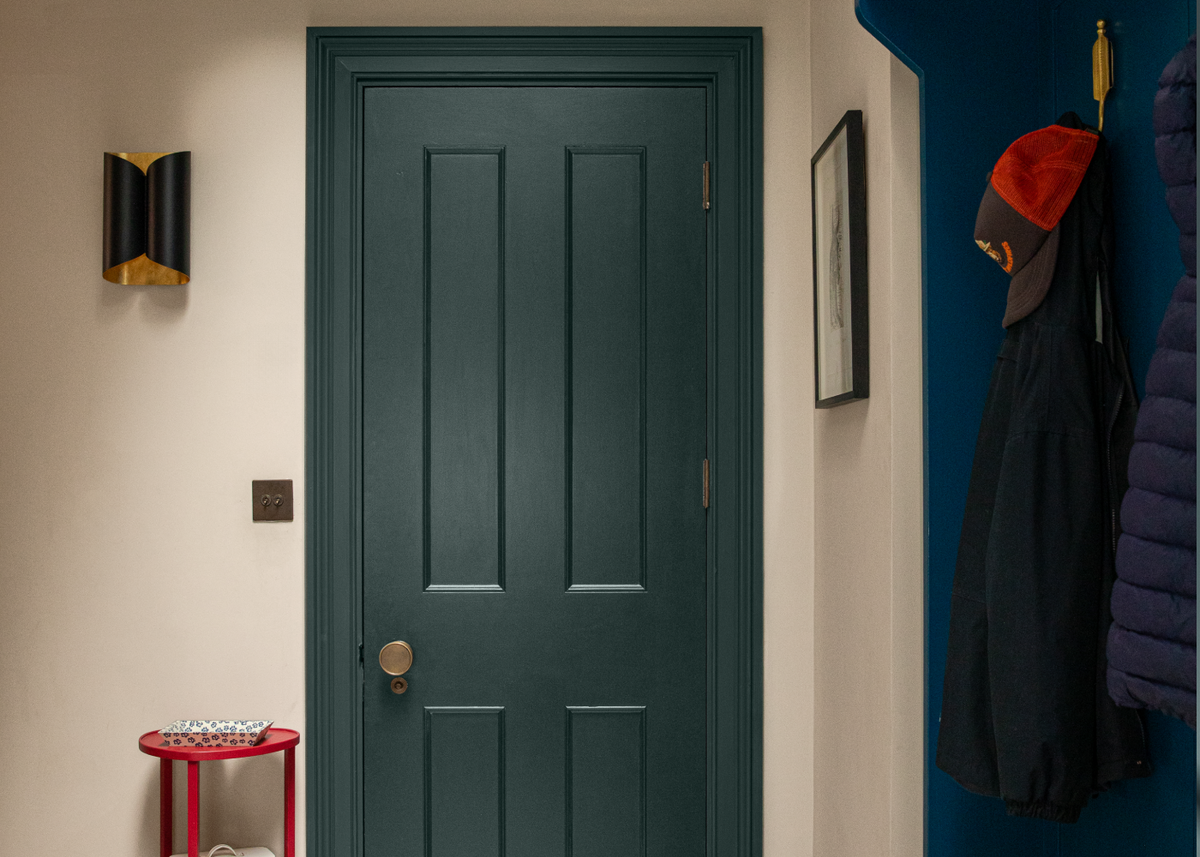
A rich blue-green that balances the restorative qualities of both colours. Sophisticated and immersive, Teal 03 brings depth and evolution to the palette, creating interiors that feel calm, layered and enduring.

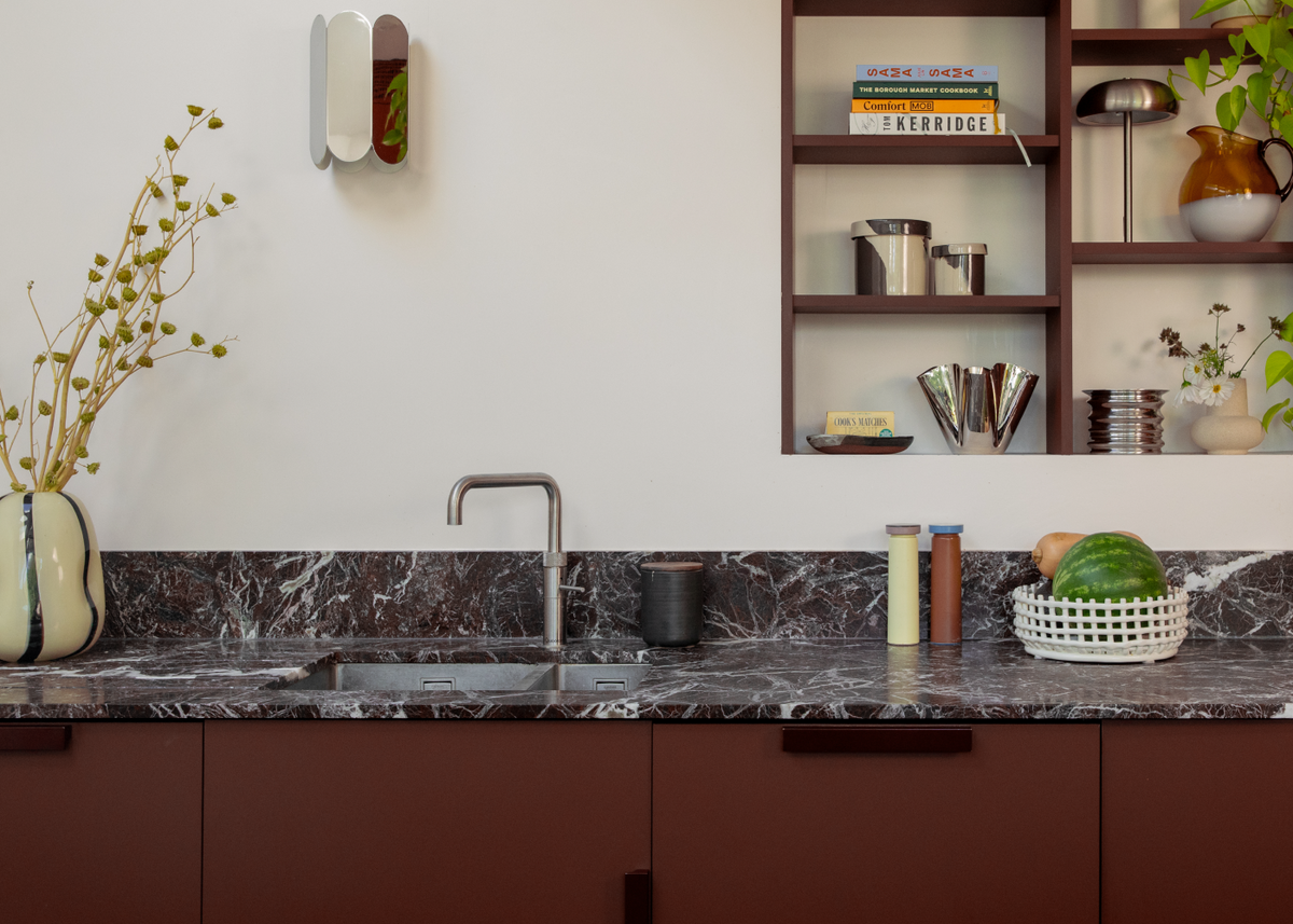
Red 07

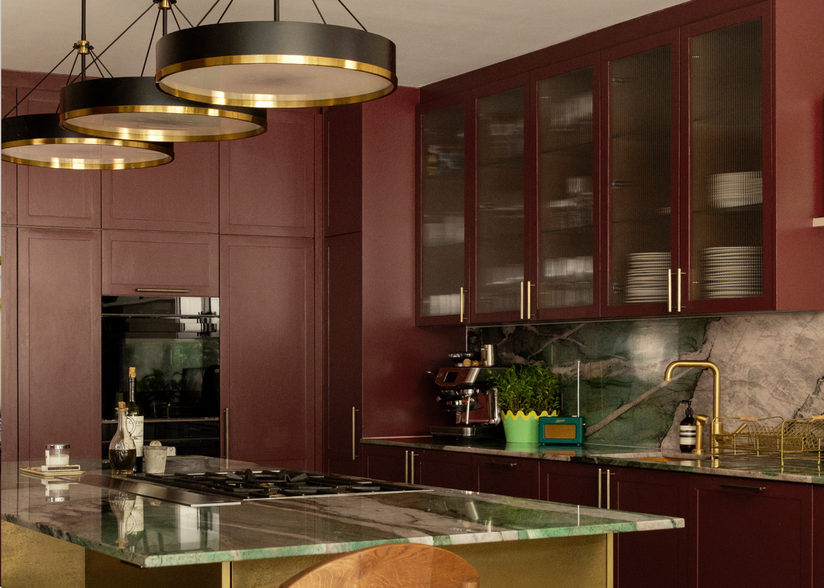
A deep chocolate-infused burgundy inspired by aged wine, terracotta and autumn leaves. Rich, cocooning and emotionally expressive, Red 07 wraps spaces in warmth while creating an atmosphere of intimacy and connection.

Pink 14

Pink 14

A soft plaster pink inspired by clay-rich earth and weathered limewash. Gentle, warm and quietly uplifting, Pink 14 brings a nurturing quality to interiors, creating rooms that feel welcoming, lived-in and effortlessly human.

Green 23

Green 23

A rich olive green with warm yellow undertones, Green 23 brings depth, grounding and connection to the home. Inspired by moss-covered woodland, dried herbs and olive groves, it creates spaces that feel restorative, settled and deeply comforting.

Behind the Edit

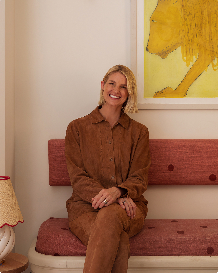
“The timeless colours in this edit have been chosen not for how they photograph but for the connection they make with a room: how they move through the day with you, shifting from morning to evening with the light, how they encourage you to relax or aid creativity and how they connect with us on a deeper level. We’re not choosing colour purely for effect, we’re choosing it for meaning."

- Tash Bradley, Director of Interior Design